 Writing this site myself requires hours of labor intensive research across the web, searching for both information and images.
In these searches I find some of the most atrocious websites, and some of these atrocities are committed by people selling horse web design.
So I developed a few rules of conduct for horse websites which will not only make my life more pleasent, but will help your website get more traffic too.
First Things First
Before you can even get started with the design you have to have the basics. Head straight to Godaddy.com and buy yourself a domain name, (it’ll run you about $15 a year) then go to WordPress.org, and download a copy of WordPress.
Why WordPress?
Stay away from blogger platforms, owning your own domain name will be beneficial to you in the future (ultimately it’s yours to control). WordPress it is just as easy to use, totally free and open source (which means it is not owned by a corporation, and it is built by the people for the people). The Equinest is built on wordpress.
Rules for Horse Web Design
That said, here are some basic rules you should follow in your horse design…
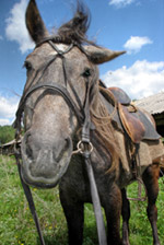
1. People who like horses love to look at pictures of them. Use lots of horse images, and make sure they are big and high-quality.

2. Ok folks, this one is serious. Loose the music / whinnys / clippity cloppity noises on the home page. Save that for those who want to listen to that stuff…most people don’t (like me) and will navigate away from your site because of it.
3. Understand the basics of SEO (that’s essentially Internet marketing for those who don’t know, SEO stands for Search Engine Optimization). Here is a little reading to get you started 12 Basic On-Site SEO Tactics for Optimized Results.
4. Ridiculously colored and patterned backgrounds are distracting and should be avoided. As soon as you see the stars it’s hard to look away from them isn’t it? Even now, as you are reading this, you can’t help but look at the stars…I rest my case.

5. Update your site regularly (wordpress makes this easy), new pages and posts are unique content and they allow you to keep your copy fresh.
6. Navigation needs to make sense and be obvious. This is an issue that goes way beyond the horse industry. If I can’t find what I’m looking for I will leave and find it somewhere else.
![]()
Understanding how people use the web is the bottom line, Have a look at some Eyetracking Research to give you an idea where people look first when a web site opens.
7. We are no longer in the 80’s, design accordingly.
8. Try to keep horses in your template to a minimum. Post images in your content to provide examples and punctuate statements, but don’t over-horse.
9. This goes hand in hand with number 5. Be sure to update your content, but also make sure your content provides good information otherwise it is worthless to us all.
10. Don’t overdo it with advertising…there is no credibility in an overdose of google ads, or flashing ad boxes. Bright advertisements slow down the load time of your pages and distract your users.

There is Always Room for Improvement
A website is like a horse itself, they need to be nurtured, cared for and maintained. Good information is useless to everyone if it can’t be found.
Use these tips to help your horse site earn more traffic and more credibility online.
Oh, my horse. Fine. 🙂
Great post! I agree that I see too many “horse” sites with blaring music, crazy colors, and too little navigation. Just because we live in barns doesn’t mean that we can’t have a little class on the internet! Happy trails.
Outstanding post!!! Too many people who do their own sites haven’t a clue that their work is an epileptic-episode-inducing nightmare!!! Thank you for writing this valuable piece!